Airbnb Email Confirmation
Redesigning the one-time code email confirmation flow
Project Overview
-
Role
Experience Design Mentee
-
Problem
Users lack visibility into whether their email is confirmed, and there's no way to re-trigger the confirmation flow if the original email is missed or lost. This can lead to login issues or account confusion, especially if the email was mistyped during sign-up.
-
Goal
To design an end-to-end confirmation flow using OTP to improve clarity, usability and security
-
Timeline
2-months
-
Skills
• Understanding account security paradigms
• Leveraging an existing design system
• Working on an established surface
-
Team
Brittany Jain (Design Mentee), Chloe Fan (Design Lead), Vicki Siolos (Content Strategy)
Current Experience


Users can’t tell if their email has been verified and there’s no way to trigger the email to confirm again.
Opportunity Statement
How might we create a more reliable and secure email confirmation experience that prevents fake account creation, allows users to easily re-trigger the confirmation flow if needed, and clearly communicates whether an email is confirmed or not?
User Scenarios
The user has an existing email that is not confirmed so takes action to confirm & is successful (happy path)
The user has an existing email that is not confirmed so takes action to confirm & is not successful (unhappy path)
The user decides to update their existing email address, so is then asked to confirm it
Explorations
Displaying confirmed/unconfirmed states
Two rows
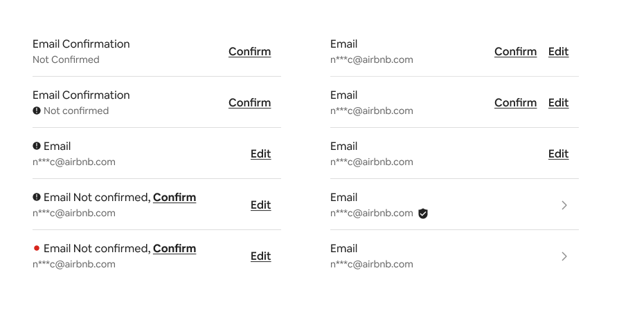
Three rows

We explored a range of design solutions before ultimately landing on a cleaner and more consistent approach. While we considered using a red dot and an additional indicator to show confirmation status, we decided against it as the action isn’t currently required and the pattern didn’t align with how similar information is displayed elsewhere (e.g., identity verification). Instead, we placed a confirm CTA next to the Edit button, aligning with existing right-aligned action patterns for a streamlined experience. We also leveraged the another design team’s alert pattern on the Account Settings page to surface user to-dos, which eliminated the need for a third line or separate indicator.
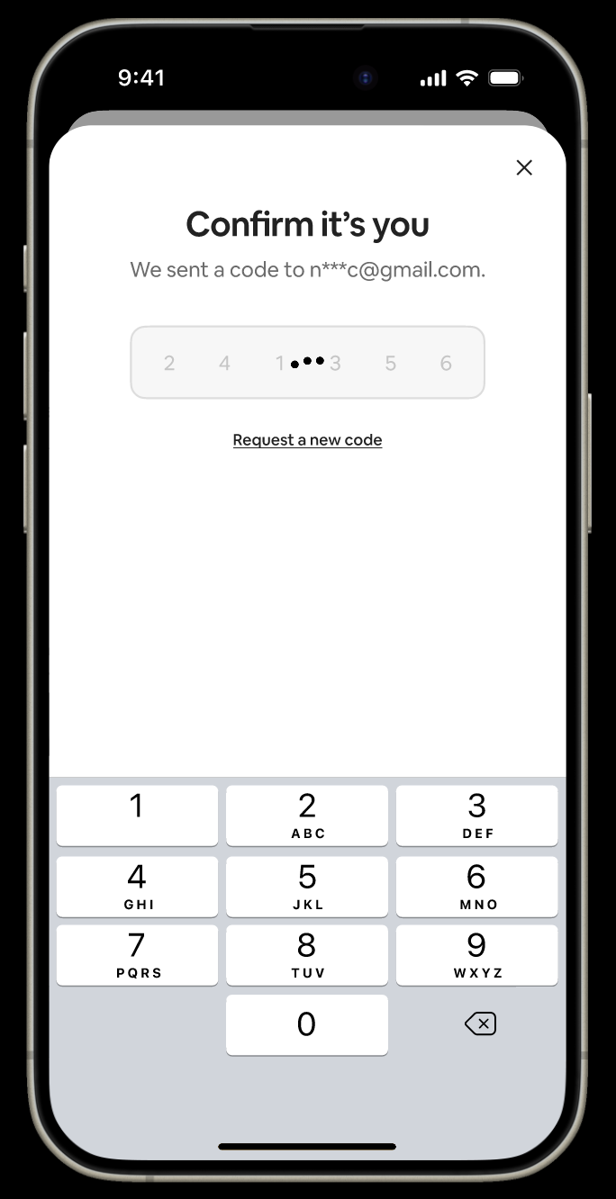
Final Design
Screens in the flow


Retrospect
Impact
Coming soon.
Lessons Learned
Partnering with adjacent design team to adopt their existing pattern for alerting users on the personal information page. This reinforced the value of how shared systems and patterns can create a more cohesive and scalable user experience.
Designing within real-world constraints which taught me how to leverage a design system, think through edge cases and collaborate cross-functionally.
Collaborating with a UX writer which taught me how critical language is in guiding users through high-trust flows.
Auditing other sections within the Personal Information page and Account Settings to identify layout patterns that would make the experience cohesive with other sections.
With more time I’d like to
Redesign how users edit their personal information.
Do an audit of other information in the app that has confirmed or verified states to make sure we are using the same patterns and treatments.